The new MINI logo: Authentic, clear and tradition-conscious
15 Dec 2017|1,069 views
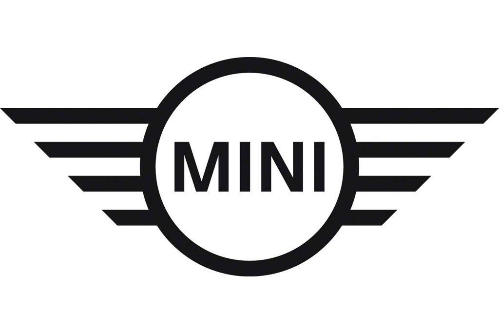
At the core of the new MINI brand identity lies an awareness of traditional values combined with the spirit of future-oriented development. This philosophy is also reflected in the visual appearance of the British premium brand, of which the central element is the MINI brand logo.
The new MINI logo draws on the three-dimensional style of depiction that has existed since the relaunch of the brand in 2001, applying this to a form of visual expression known as 'flat design' that homes in on the key graphic elements. The preservation of the fundamental, tradition-steeped motif of a winged wheel with the brand name printed in capital letters at the centre ensures the logo will be instantly recognised.
The deliberate avoidance of shading and grey tones creates a starkly contrasting black-and-white effect that conveys the authenticity and clarity of the new brand identity, its two-dimensional character also allowing universal application. The new logo will be applied as a product label to all MINI models - on the bonnet, at the rear, at the centre of the steering wheel and on the remote control.
The latest redesign ushers in another chapter in the varied history of the MINI brand logo. There is an especially striking similarity with the signet introduced for the classic Mini in the mid-1990s. At that time, the brand name also appeared in uppercase letters in the middle of a circle with stylised wings.
Latest COE Prices
April 2024 | 2nd BIDDING
NEXT TENDER: 08 May 2024
CAT A$94,010
CAT B$102,001
CAT C$68,502
CAT E$103,249
View Full Results 
Thank You For Your Subscription.