Opel to change its logo
25 May 2008|9,117 views


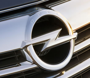 |  |
The restyled emblem will still feature the Opel nameplate and lightening bolt, but will be coated in polished metal and will attempt to signify Opel's move upscale in the European market. It will be unveiled at this year's London Motor Show. The new badge will debut on the all-new Opel Insignia.
"The Insignia embodies the confident, exciting direction we are taking at Opel," says Alain Visser, Chief Marketing Officer GM Europe. "And this direction is immediately clear from the polished, even higher class brand emblem. We will naturally use the new emblem from now on in all future models."
The latest logo proudly integrates the Opel name into a wider border that circles the trademark lightning bolt. It has a more sculpted design with spherical surfaces that give the emblem three-dimensional depth.
The Opel Blitz is one of the most recognizable brand logos in Europe and has adorned the company's vehicles since 1963. "The Opel Blitz evolved from a zeppelin - a symbol of progress at that time - which had been the radiator emblem of Opel vehicles since the beginning of the 1930s," explains Heinz H. Zettl, Manager Opel Heritage & Institutional Communications. "In 1937, a circle was added - a wheel to symbolize mobility." This evolution was also influenced by the brand name of Opel's light commercial vehicles, which from 1930 to 1975 bore the name "Blitz" and featured a lightning bolt as a distinctive symbol.
| |
The restyled emblem will still feature the Opel nameplate and lightening bolt, but will be coated in polished metal and will attempt to signify Opel's move upscale in the European market. It will be unveiled at this year's London Motor Show. The new badge will debut on the all-new Opel Insignia.
"The Insignia embodies the confident, exciting direction we are taking at Opel," says Alain Visser, Chief Marketing Officer GM Europe. "And this direction is immediately clear from the polished, even higher class brand emblem. We will naturally use the new emblem from now on in all future models."
The latest logo proudly integrates the Opel name into a wider border that circles the trademark lightning bolt. It has a more sculpted design with spherical surfaces that give the emblem three-dimensional depth.
The Opel Blitz is one of the most recognizable brand logos in Europe and has adorned the company's vehicles since 1963. "The Opel Blitz evolved from a zeppelin - a symbol of progress at that time - which had been the radiator emblem of Opel vehicles since the beginning of the 1930s," explains Heinz H. Zettl, Manager Opel Heritage & Institutional Communications. "In 1937, a circle was added - a wheel to symbolize mobility." This evolution was also influenced by the brand name of Opel's light commercial vehicles, which from 1930 to 1975 bore the name "Blitz" and featured a lightning bolt as a distinctive symbol.
Latest COE Prices
June 2025 | 1st BIDDING
NEXT TENDER: 18 Jun 2025
CAT A$96,999
CAT B$113,000
CAT C$62,000
CAT E$113,900
View Full Results 
Thank You For Your Subscription.


Tags
Products & Services
For Owners
Quick Links
About Sgcarmart
